Main Content Title
Here is main content text.
Last modified 3/21/2023
To add styling and visual elements to a page, there are a number of ISU macros that were created for the knowledge base to match the Illinois State University theme starting with '-ISU'.
There are a number of other non-ISU macros that you can use at your own risk. If you find you would like to use a non-ISU macro, but have it be ISU themed, fill out a ticket to request an ISU macro be created.
You must be editing a page to access ISU macros.
 > Other Macros
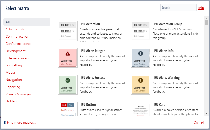
The -ISU Accordion and -ISU Accordion Group are used to group your accordion together. Start with the -ISU Accordion Group and put one or more -ISU Accordion macros inside the group.
A vertical interactive panel that expands and collapses to show or hide content. Must use inside an -ISU Accordion Group.
A container for -ISU Accordion. Place one or more accordions inside this group.
<Ex: We are in an accordion>
Alert macros notify the user of important messages or system feedback.
Use only if there is a risk of physical harm OR in conjunction with the Success alert in comparing when NOT to do something.
Most commonly used for tips and information.
Use for successful submissions OR in conjunction with the Danger alert in comparing when to do something.
Use when there is a risk of non-physical harm.
Buttons are used to signal actions, submit forms, or trigger new content within the current context.
There are a number of available options to choose from the
The -ISU Card and -ISU Card Group are used to group your cards together. Start with the -ISU Card Group and put one or more -ISU Card macros inside the group. Great for landing or homepages.
A card is a boxed section of content about a single topic with options for images, titles, text, and buttons. Must use inside an -ISU Card Group.
Options:
A container for -ISU Card Group. Place one or more cards inside this group.
Options:
Bacon ipsum dolor amet prosciutto tenderloin pastrami ground round pork capicola, filet mignon andouille bacon.
Bacon ipsum dolor amet prosciutto tenderloin pastrami ground round pork capicola, filet mignon andouille bacon.
Bacon ipsum dolor amet prosciutto tenderloin pastrami ground round pork capicola, filet mignon andouille bacon.
Bacon ipsum dolor amet prosciutto tenderloin pastrami ground round pork capicola, filet mignon andouille bacon.
Add the Children Display macro to a page to display a list of pages from a specific part of the page hierarchy.
Example of Children under the Knowledge Style Guide:
The Content by Label macro is used to display lists of pages, blog posts or attachments that have particular labels. It's great for collecting related pages together and filtering out content that you don't want to see.
For example, you could use this macro to display a list of all pages that have the label 'feature-shipped' and include the word 'Blueprint', or to list any pages with the label 'meeting-notes' that you've been mentioned in.
Example:
The Page Properties macro uses key/value pairs. To display different styles of templates on a page you could add a table like below to your page properties. You would want to display you page properties as hidden.
| Property Name | Value |
|---|---|
| SearchIntroText | About your site. |
| SearchThingsToTry | email, office 365, reggienet... |
| SearchButtons |
For use on the Technology site to have Tech Topics only on the right side.
| template | tech-topics.vm |
|---|
For non-standard, full-width pages. Using these pages will require the page to have -ISU Section macros.
| template | landing-page.vm |
|---|
Sections create visual separations between items. Great for landing or homepages.
Change the color of a section's background.
Options:
Adding Main Content and Sidebar inside of an -ISU Section allows the page to have a sidebar to the right. You must also choose Sidebar Grid: Right Sidebar in the -ISU Section properties for this to work properly.
A pre-styled section with a row header, left column title and text, and quick links.
Options:
A pre-styled section with a row header, intro section and columns.
To suggest an update to this article, ISU students, faculty, and staff should submit an Update Knowledge/Help Article request and all others should use the Get IT Help form.