Accessibility
Power Point Accessibility Ribbon
Last modified 10/25/2024
The PowerPoint Accessibility Ribbon consolidates all the tools you need to ensure your presentations are fully accessible. It allows you to manage everything from reading order to alt text, slide titles, and color contrast. By using these built-in tools, you can quickly identify and fix any potential barriers, ensuring your content is easy to navigate and understand.
General Tips for Accessible Presentations
- Starting with an accessible PowerPoint template saves time and ensures accessibility from the start. You can find these templates in the Microsoft Template Gallery or by going to File > New in PowerPoint and searching for "accessible templates."
- When designing your presentation, aim for simplicity by focusing on only a few main ideas per slide.
- Using bullet points can help organize information clearly and make it easier to digest.
- Additionally, it's important to ensure your text is readable, so choose a font size of at least 24points for better visibility.
How to Use the Accessibility Checker in PowerPoint
Microsoft PowerPoint provides a built-in accessibility checker that reviews your presentation for accessibility issues. Follow the tips below to make your presentations more accessible.
Open Your Presentation
Launch the PowerPoint file you wish to review.
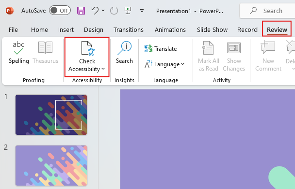
Navigate to the Review Tab & select Check Accessibility
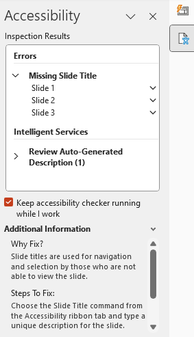
Click on the Review tab in the menu at the top of the screen. In the Review tab, click on Check Accessibility. This will open the Accessibility Ribbon and Accessibility Checker pane on the right side of the screen.
Note: If you don't see the Check Accessibility option, alternatively, you can access the Accessibility Checker from the File menu:
- Click on the File tab to access the backstage view.
- In the sidebar, click on Info.
- Click on Check for Issues next to Inspect Presentation.
- Select Check Accessibility from the dropdown menu.
This checker is a good place to start, but it’s important to remember that it is automatic and may not detect all of your presentation’s accessibility issues.
Reviewing Accessibility Issues
Accessibility Checker Pane
The pane categorizes issues as Errors, Warnings, or Tips. Errors are severe issues that can make the content difficult or impossible to understand. Warnings indicate content that may cause problems for some users. Tips suggest improvements for better accessibility.
Common Accessibility Issues in PowerPoint and How to Fix Them
Missing Slide Titles
What to Do: Ensure every slide has a unique title.
How: In the Accessibility Checker pane, select the issue under Missing Slide Title. Click on the slide thumbnail or use the "Add Slide Title" option to insert a title.
Why: Slide titles help users navigate the presentation using assistive technologies.
Incorrect Reading Order
What to Do: Ensure that slide content is read in the intended order.
How: In the Accessibility Checker pane, locate the Reading Order issue. Click on Verify object order, which opens the Reading Order pane. Rearrange items by dragging them into the correct sequence.
Why: Proper reading order is essential for users relying on assistive technologies to understand the content logically.
Images Without Alternative Text
What to Do: Add descriptive alternative text to images, charts, SmartArt graphics, and other visuals.
How: In the Accessibility Checker pane, under Missing Alt Text, select an image. The Alt Text pane appears where you can enter a description.
Why: Alt text allows screen readers to convey the meaning of visuals to users with visual impairments.
Insufficient Color Contrast
What to Do: Use high-contrast color combinations between text and background.
How: In the Accessibility Checker pane, select the Low Contrast issue. Adjust text or background colors to meet contrast standards.
Why: Adequate contrast ensures text is readable for users with visual impairments. Discover tips for choosing colors with accessibility in mind.
Feedback
To suggest an update to this article, ISU students, faculty, and staff should submit an Update Knowledge/Help Article request and all others should use the Get IT Help form.


