Accessibility
Accessibility Tips for PowerBI
Last modified 2/12/2026
Power BI helps people to visualize complex data through charts and graphs, facilitating data-driven decision-making across organizations of all sizes. Because this product relies heavily on visulaizations we need to ensure that all people can interact with the reports and dashboards including people with visual, motor, and cognitive disabilities.
Built-In Power BI Accessibility Features
Power BI provides several accessibility capabilities right out of the box:
- Keyboard Navigation & Assistive Tools
- Keyboard navigation throughout Power BI Desktop and online reports.
- Screen-reader compatibility for supported objects.
- High contrast mode: Power BI applies system high-contrast themes automatically and supports manual selection in the service.
- Focus Mode: Users can expand visuals to focus on one at a time.
- Show Data Table: Press Alt + Shift + F11 to see visuals in tabular, screen reader–friendly form.
Authoring Accessible Reports
Report creators should actively use accessibility features — here’s how:
Alt Text for Visuals & Objects
Add descriptive alternative text to every meaningful visual, image, or shape. Alt text helps screen readers convey the purpose and content of visuals. Alt text should be around 25 characters. For lines/boxes, note it as decorative image.
Best Practice: Include what the visual shows and why it’s important.
Logical Tab Order
Keyboard users rely on predictable tab order.
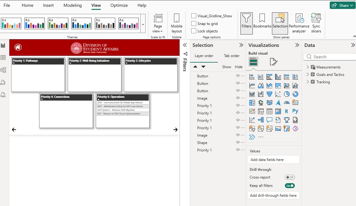
In Power BI Desktop go to View → Selection → Tab order to reorder elements so they follow a logical reading order.
Suggested tab order:
- Title
- Filters/navigation
- Visuals (present them in logical order)
Titles & Labels
Ensure every visual/chart has a clear, unique title and appropriate labels.
Avoid vague names like “Chart1” — instead name it with meaningful text like “Student Enrollement”.
Good labels also help users with cognitive disabilities understand the data quickly.
Color & Contrast
Ensure text and background contrast meets at least 4.5:1 per WCAG.
Avoid using color alone to communicate information; use icons, patterns, or text labels instead.
Use accessible color palettes or contrast checker tools (e.g., WebAIM, Color Contrast Analyzer).
Markers for Charts
For line charts or visuals with overlapping data:
Turn on markers (e.g., circles, squares) to help differentiate lines beyond color differences, especially for color-vision deficiencies.
Structural & Design Best Practices
- Keep Layout Clear and Predictable
- Align visuals in a consistent pattern.
- Group related controls together (filters with charts they affect).
- Avoid excess decorations or visuals that don’t convey data.
- Use Simple, Consistent Navigation
- If your report has many pages, provide a consistent navigation region or buttons to help users jump around without confusion.
IScreen Reader Navigation & Keyboard Shortcuts
Provide navigation guidance in documentation for users who rely on keyboard/screen readers. Useful shortcuts include:
| Action | Windows | Mac |
|---|---|---|
| Enter embedded report (iframe) | Ctrl + Enter | Cmd + Return |
| Move among report sections | Ctrl + F6 | Cmd + F6 |
| Enter focus mode | Alt + Shift + F11 | Option + Shift + F11 |
Once in focus mode, use Tab or arrow keys, and press Esc to exit.
Resources
- Microsoft: Desktop Accessibility Creating Reports
- Microsoft: Desktop Accessibility Overview
- Yale Guidance for Assistive Technology users
Feedback
To suggest an update to this article, ISU students, faculty, and staff should submit an Update Knowledge/Help Article request and all others should use the Get IT Help form.