Accessibility
Accessible Templates in Microsoft PowerPoint
Last modified 2/16/2022
PowerPoint templates are a great way to start your presentation. The templates available have the formatting needed for accessibility already built-in. They help provide a heading structure and reading order. Templates also are key to a consistent look and feel to the slides and improves readability. Templates have many types of slide designs
Choosing Your Template
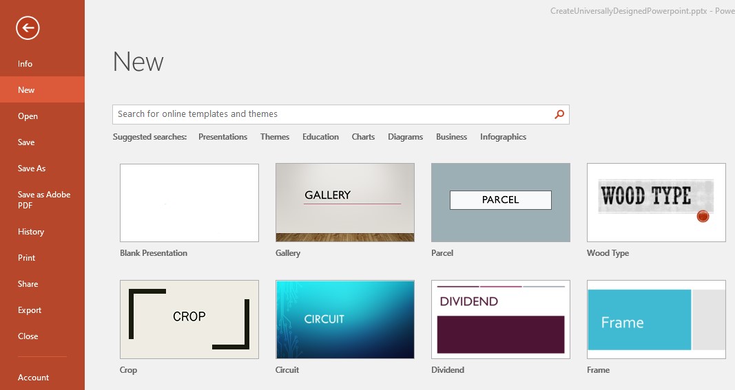
Step 1: New
When creating a new PowerPoint presentation, select File then choose New option. On the New screen, choose a template.
Note: Avoid choosing the Blank Presentation option. Blank Presentations do not have the features needed for an accessible presentation.
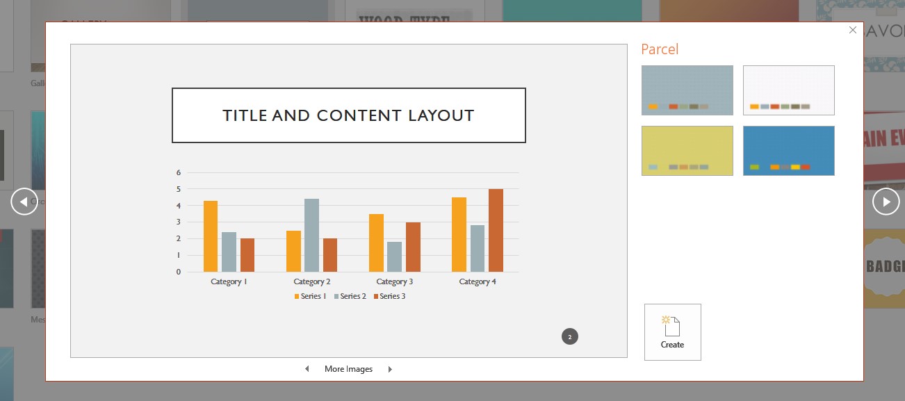
Step 2: Choose a Color Scheme
Select a base color or design scheme then choose the Create button.
Adjusting Your Template
You can fine-tune your template by adjusting the size of the text, color settings, and more in the Slide Master. If you use the template's text fields and component options, making your changes in the Slide Master with ensure all changes are carried out through the template. You will not need to go from slide to slide to make small font or color changes.
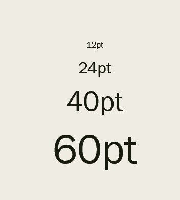
Text size
Text size is important especially if you are presenting in large spaces or online. The minimum text size for any slide should be about 24 points. Anything smaller will be difficult to read in large rooms and from far away from the screen. Using larger text fonts will help improve the readability of your slide from a distance.
Font Style
Use san serif fonts for presentations (e.g. Times New Roman, Helvetica, and Arial). Serif fonts (e.g. Baskerville, Georgia, Palatino) and script fonts (e.g. Brush Script, Lucinda, and Papyrus) have decorative finishes at the end of the letters. These decorations can make the letters difficult to read and hard for text recognition software to identify letters.
Color
- Use high contrasting colors between text and background
- Avoid color as the sole source of information
- Use off white backgrounds