CAS-IT Home
Information Architecture: Department Website Design and Structure
Last modified 4/25/2024
Modified 2/16/2024
In this article:
- What is Information Architecture?
- Methods for organizing information
- How to utilize visual elements
- Examples
What is Information Architecture?
Information Architecture (IA) refers to the way a website is designed to make the process of searching for information easy and intuitive. Think of it as creating a map to imagine the route users will take to find something, and structuring your site around that map. The way you display content on your websites should effectively show users how to find what they are looking for without becoming confused or overwhelmed.
Good IA results in your user quickly becoming accustomed to your site’s layout and utilizing its features effectively, completing whatever task they have with as little trouble as possible. In general, good IA goes unnoticed, but bad IA does not. This page will go over some of the basic principles of information architecture, as well as some ways to help you sort information on your own site.
Methods for Organizing Information
There are multiple strategies to implementing information architecture. Below are some ways to figure out an effective structure of your site.
Card Sorting
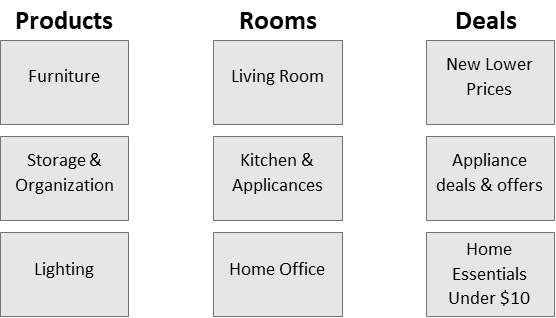
One common method for implementing IA is called card sorting. Despite its name, it does not always require physical cards. It is a way to sort subjects into predetermined categories to test if information is where users would expect to find it.
To do this method, label each card with its own piece of information you want included on the website. Then, group them based on which category they fall under. For example, if one of your categories is an “About” page for your organization, the cards you may sort under it could be “History,” “Mission,” and “Goals.” Below is an example of a digital version of this, using information from the IKEA website.
If you still feel unsure about the results of your card sorting, recruit a few willing volunteers to go through this process and compare the results. That way, you have an outside perspective on how intuitive your site’s navigation is.
Information Flow Charts
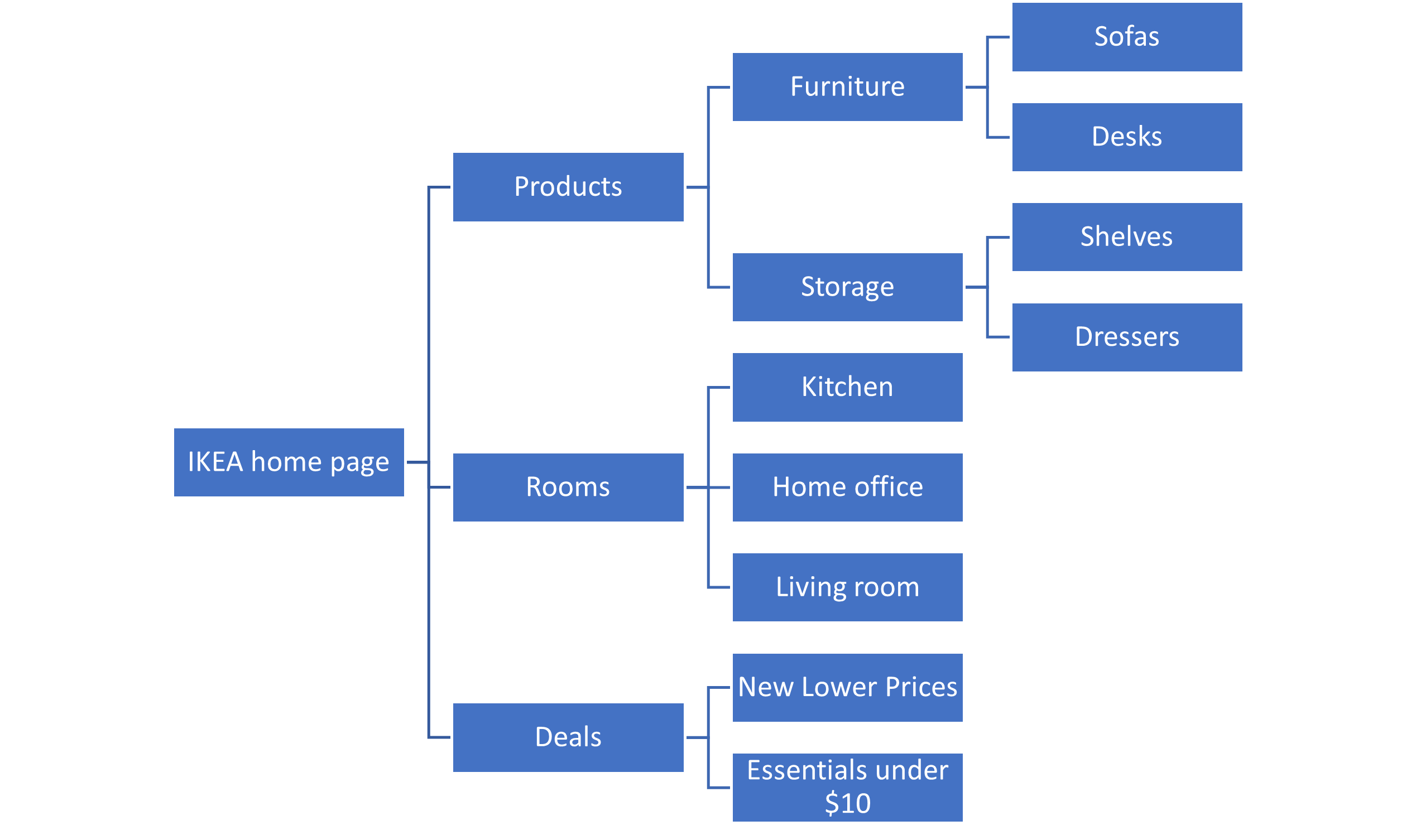
Another method of laying out the content of a website is to create an information flow chart. This helps break down content into categories while also showing the paths a user might take. Using the information as the example of card sorting, shown below is an information flow chart example of the IKEA website. Though it looks similar, information flow charts are better at representing a hierarchy of information, as well as mapping how users can get from one page to another.
Utilizing Visual Elements
Visuals are important to making a website look more interesting, but they are also good methods when it comes to displaying information. Here are some things to keep in mind when adding visual media to your site.
Images
Be sure that each image you add serves a purpose and directly relates to the written subject matter. Using images that are objectively interesting, visually appealing, or attention-grabbing can be beneficial. Always make sure that images are high-resolution, and consider creating alt text in order to make your site more accessible to those who use screen readers.
Icons
Icons are small visual tools used to represent functions on an interface. A user will be able to navigate a site using the icons, limiting the number of words used on the screen. Icons should be simple, consistent, and universal. For example, a magnifying glass is commonly associated with the search function, and a heart usually means “like” or “favorite.” These are icons with unambiguous meanings, and therefore effective as a shortcut for written information.
Another important aspect of icons (or other small visual cues) is consistency. Below are some icons from the IKEA website. Although each of them has a different meaning, they have a similar style, making the page look more visually consistent.
Visit Google's Icon Library to see different icons and their meanings.
Color
Though you might be limited with how much color you can incorporate into your site, it’s important to take color contrast into consideration if you are adding things such as text onto images or text boxes with a colored background. When you do this, the color of the text against the color of the background may make it difficult to read, especially to those with visual impairments. Use the WebAIM Contrast Checker to test the readability of text on your site if it’s anything other than black text on a white or light gray background.
Examples of Good Information Architecture
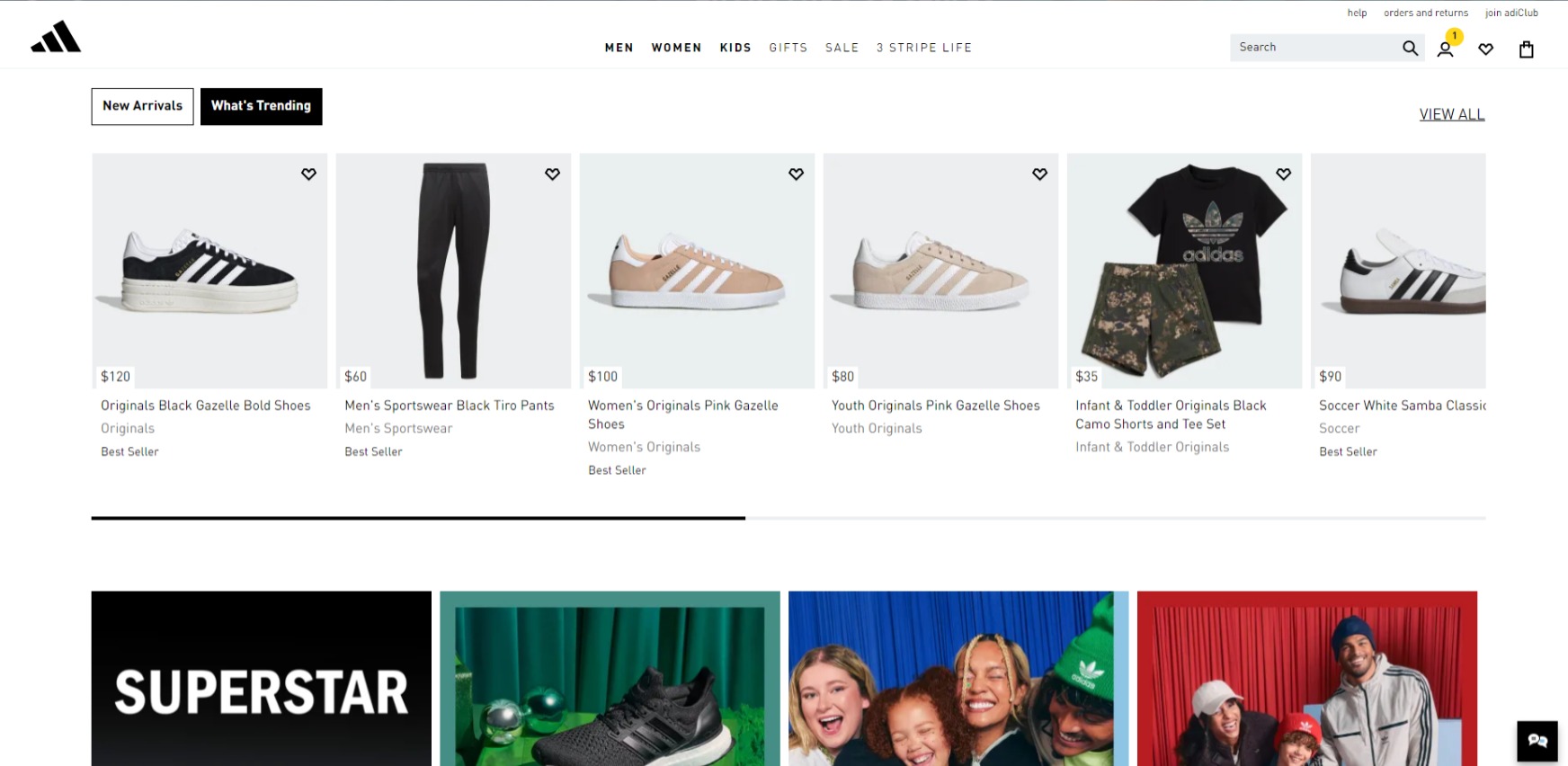
To see how all these ideas come together in practice, here is an example of good IA from the Adidas home page. There's a visually appealing balance of words and images, with a clear navigation bar at the top with broad categories of different shoes. When these categories are hovered over, it reveals its subcategories to better narrow down a user’s search. Navigation bars are helpful to keep some information hidden so the user isn’t bombarded by too many choices.
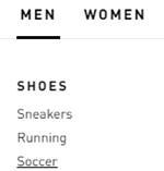
Below is an example of these categories in action. If a user was looking for men’s shoes used for playing soccer, they would hover over “Men,” go to “Shoes,” and then click on “Soccer” (see figure 2). If the user cannot find what they need using these categories, the search bar is always at the top right no matter where the user is on the website.
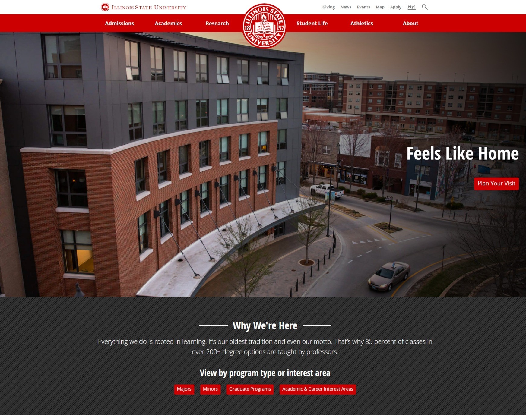
Illinois State’s home page is also a good example of effective IA. The home page doesn’t have a huge mess of information, but rather the important things that prospective students would be visiting the site for, such as clearly labeled tabs for academic programs and visiting campus. Other information requires a little more work to find.
Examples of Bad Information Architecture
A poorly organized site might prevent people from visiting it again, especially if they never end up finding the information that they need. If you put too much content on a page, how do users know where to look?
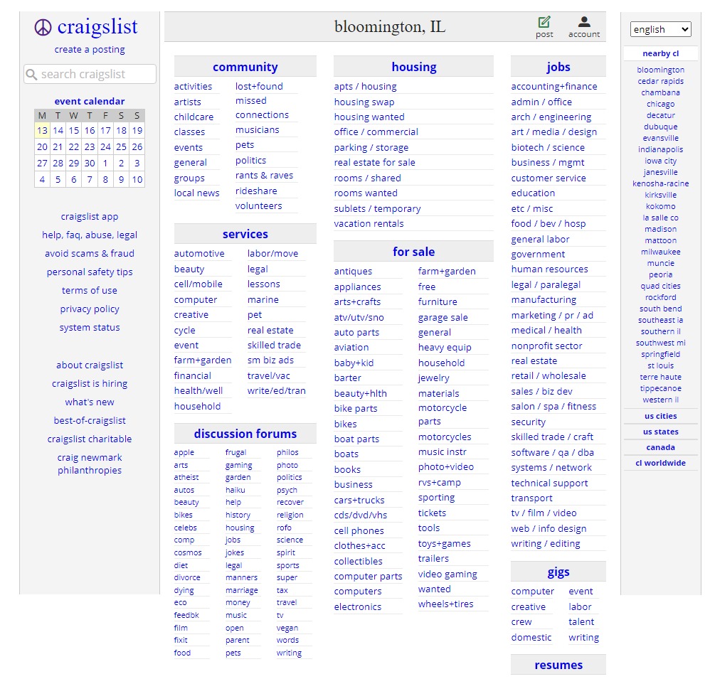
The Craigslist home page is an example of bad IA. The lack of images and white space cause a blur effect on the page. If you're not familiar with the site, you may have to scan the entire page and read all of the links in order to find what you are looking for. There are dozens of links on just one page alone that gives a user too many options to look through all at once, and too many choices can be overwhelming. It's a good idea to limit the number of things to look at on a screen, like seen in the examples of good IA above.
Information architecture involves a balance between how much information is shown immediately and how much needs a little bit more navigating to be found. You don’t want to put all the information on your site on one page (see the above example), but you also don’t want to hide your information in endless layers of subcategories. Try putting yourself into the shoes of a potential user of your site and figure out the most intuitive way to go about organizing it.
Feedback
To suggest an update to this article, ISU students, faculty, and staff should submit an Update Knowledge/Help Article request and all others should use the Get IT Help form.
