Accessibility
Columns
Last modified 8/4/2023
Page layouts that use multiple columns can be tricky for screen readers to read. Column layouts can affect the natural reading order of content for screen readers. Screen readers will typically read a document left to right, top to bottom. If columns are formatted correctly in HTML or digital documents then the content can be read by screen readers in the correct reading order.
If the columns are not appropriately structured in the HTML or in digital documents then the content could be read out of order, making it difficult to understand.
Key Considerations
On webpages, use semantic HTML elements to structure content, including appropriate headings and landmarks.
Avoid using the tab key to put visual white space between lines of text to make columns. Doing so will cause screen readers to read content out of order.
Ensure the correct reading order of content by placing it in the HTML or digital document text in the intended reading sequence.
Provide sufficient context and connections between content in different columns.
Avoid complex nested column structures.
Test the page with screen readers to identify and address any potential accessibility issues.
Check the Reading Order
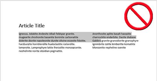
A simple way to check the reading order of a webpage or digital document is to highlight the text of the page. Does the highlighted text follow a logical reading order? If not, then remediation will be necessary to fix the reading order.
Resources
Feedback
To suggest an update to this article, ISU students, faculty, and staff should submit an Update Knowledge/Help Article request and all others should use the Get IT Help form.
